Overview:
Welcome to Power BI December 2021 updates. This time Microsoft has released
one new feature called “Sparklines” for Table and Matrix visual in Power BI.
In this article, we will try to understand the “Sparkline” concept in detail.
So, Let’s get started!
What is Sparkline?
Sparklines are tiny charts shown within cells of a table or matrix that make
it easy to compare a large number of trends quickly. We can use sparklines to show trends in a series of values, (e.g., seasonal
increases or decreases, economic cycles, or to highlight max and min values).
Enable Preview Feature:
The sparkline feature is in preview at this moment. Go to the File menu,
select options, and settings, and then click on Options. Select “Preview
Features” from the left navigation and select “Sparklines”.

How to create a Sparkline for Table and Matrix?
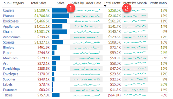
Consider the following example. Here, we want to represent “Sales Order” and
“Profit” sparklines. The result will look like the following.
-
Select the “Sales” column and click on “Add Sparkline”.
- This will open the following pop up
-
Select “Order Date” on X-Axis and select Summarization as “Sum”.
-
This will add the following Sparkline in a table and it is added as a new
column on the table


Now, let’s add a sparkline for “Profit” by month.
- Select the “Profit” column and click on “Add Sparkline”.
-
This will open the following pop up
- Select “Month” on X-Axis.
-
This will add the following Sparkline in a table and it is added as a new
column on the table.


Formatting Options:
We have main two formatting options:
- Chart Type = Line or Bar (We can choose any based upon our requirements)
- Marker = If Chart type is Line, then we can choose on which data point we want to show marker and we can define the separate colors for our marker.
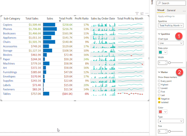
The same way you can apply Sparkline settings for Matrix visual.
Limitations:
- Power BI supports up to five sparklines per visual and will display up to 52 points per sparkline.
- For performance reasons, the maximum number of columns in a matrix will also be limited to 20 when sparklines are on.
- Note that Sparklines will be supported on Azure AS, it is not supported in any current on-prem SSAS but should work with future SSAS releases as well.
Conclusion:
This is how we can implement Sparklines in OOTB manner. Isn’t that cool? Happy Reporting!!
If you have any questions you can reach out our
SharePoint Consulting
team
here.


No comments:
Post a Comment