Showing posts with label Power BI. Show all posts

October 13, 2022

Add Customized Disclaimer message for developers before Publishing Power BI Report

Overview:

In this blog, we will talk about how we can customize a Publish message in Power BI Desktop. This tip will help us to provide a disclaimer to our end-users before they publish any reports to Power BI Service. So, now let’s get started!

  1. Open your Power BI Service account.
  2. Go to Admin Center.
  3. Go to Tenant Settings and expand “Show a custom message before publishing reports”
  4. Turn on the feature and add the following custom message. You can add any message based on your customization.
     #### Important Disclaimer  
     Before publishing the report to a workspace, make sure the user is a part of the workspace.  
    
  5. Click on Apply.
  6. Wait for 15-20 minutes to reflect the changes to Power BI Desktop.
  7. Sign out and Sign In again to your Power BI Desktop. Now, we will be able to see customized publish messages for our Power BI Desktop.

Conclusion:

This is how we can easily customize publish messages for our Power BI Desktop. Isn’t that amazing?

If you have any questions you can reach out our SharePoint Consulting team here.

September 8, 2022

How can we Pad 0 to Integer Values in Power BI?

Overview:

Sometimes we have a requirement, where we need to Pad “0” to our numeric value. There are multiple ways to implement this. But we will go with the simplest and easiest one! So, let’s get started!

Step 1:

This is our Sample Data Source, where we have Project ID, Project Name, and Hours column.

Now, we want to pad “0” before our Project ID column and need the end outcome like the following. So, how can we achieve this?

Step 2:

 - Open Model View of Power BI Desktop and select the “Project ID” column.
 - From Format, select “Custom”.
 - Under Custom Format provide, format as “00#” – This will suggest, from a 3-digit number, it will pad leading digits with “0”. 

Example: If the number is 9, it will show as “009”. If the number is 19 then it will show as “019”. This will show us the end outcome as below screen!

Conclusion:

This is how we can simply pad leading “0” before the number in Power BI. Isn’t that cool? Happy Reporting!

If you have any questions you can reach out our SharePoint Consulting team here.

February 3, 2022

How to create Sparklines in Power BI Tables and Matrix Visual?

Overview:

Welcome to Power BI December 2021 updates. This time Microsoft has released one new feature called “Sparklines” for Table and Matrix visual in Power BI. In this article, we will try to understand the “Sparkline” concept in detail. So, Let’s get started!

What is Sparkline?

Sparklines are tiny charts shown within cells of a table or matrix that make it easy to compare a large number of trends quickly. We can use sparklines to show trends in a series of values, (e.g., seasonal increases or decreases, economic cycles, or to highlight max and min values).

Enable Preview Feature:

The sparkline feature is in preview at this moment. Go to the File menu, select options, and settings, and then click on Options. Select “Preview Features” from the left navigation and select “Sparklines”.

How to create a Sparkline for Table and Matrix?

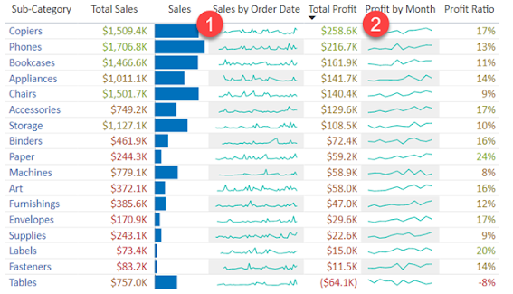
Consider the following example. Here, we want to represent “Sales Order” and “Profit” sparklines.  The result will look like the following.

  • Select the “Sales” column and click on “Add Sparkline”.
  • This will open the following pop up
  • Select “Order Date” on X-Axis and select Summarization as “Sum”.
  • This will add the following Sparkline in a table and it is added as a new column on the table

Now, let’s add a sparkline for “Profit” by month.
  • Select the “Profit” column and click on “Add Sparkline”.
  • This will open the following pop up
  • Select “Month” on X-Axis.
  • This will add the following Sparkline in a table and it is added as a new column on the table.

Formatting Options:

We have main two formatting options:
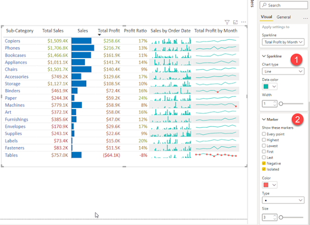
  1. Chart Type = Line or Bar (We can choose any based upon our requirements)
  2. Marker = If Chart type is Line, then we can choose on which data point we want to show marker and we can define the separate colors for our marker.
The same way you can apply Sparkline settings for Matrix visual.

Limitations:

  • Power BI supports up to five sparklines per visual and will display up to 52 points per sparkline. 
  • For performance reasons, the maximum number of columns in a matrix will also be limited to 20 when sparklines are on. 
  • Note that Sparklines will be supported on Azure AS, it is not supported in any current on-prem SSAS but should work with future SSAS releases as well.

Conclusion:

This is how we can implement Sparklines in OOTB manner. Isn’t that cool? Happy Reporting!!

If you have any questions you can reach out our SharePoint Consulting team here.

December 18, 2020

Binary Republik Proud to be Named a Global Leader on 2020 Clutch 1000!


Here at Binary Republik, we know it’s been a difficult year all around. Despite the conditions, we’re proud to report we’ve maintained our standards of quality and service as a leading Microsoft Technology Consulting company. We made sure that our clients had access to cutting edge technology and were able to get acclimated to a new normal.

As a wonderful way to wrap up the year, we’ve been featured in the Clutch 1000, an exclusive list of the top 1% of vendors on their platform. Clutch is a B2B market research authority that uses a one-of-a-kind ranking formula to identify key players in the services space.

We are thrilled to have been chosen as one of the top Microsoft Technology Consulting company and it proclaims our dedication and quality of the work we deliver to Microsoft ISVs, MSPs, MVPs, and more - Jaldeep Patel, Global Director, Binary Republik

We couldn’t have earned this award without the help of our wonderful clients. Take a look at some of
the kind words they had to share about our work when interviewed by the Clutch team:

“The most impressive aspect of Binary Republik was the size of both their team and their knowledgebase. Many firms only specialized in custom development or system architecture. Other firms didn't have an expert for every subject, but with Binary Republik we knew that someone on their team would be able to help us find an answer. Because of their size, they are also able to get back to us quickly while still maintaining genuine communication and professional relationship.”
                                                            – Web Applications Developer, Community College

“Binary has a great team that is focused on helping customers to solve their problems. They come to the table with an open mind and give realistic honest solutions and suggestions. They estimate and on-time delivery is unmatched”
                                                             – VP of Product & Engineering, Inkriti

“Like many companies, we've had varying degrees of success with offshore & outsourcing, especially outside Europe. However, Binary Republik displayed none of the negative aspects typically experienced with offshore vendors whilst remaining significantly more competitive than onshore vendor partners.”
                                                             – Product Manager, Education Services Company

We’re honored to be recognized by Clutch and our clients, and look forward to even more success in
2021! If you’re new to Binary Republik, contact us today to learn more about our award-winning
strategy and how it can help fuel your success in the new year!

May 4, 2020

How to create a Drill Through Button in Power BI?

Overview:
In this article, we will learn about one of the most important features rolled out in March 2020 Power BI Desktop update which is – Drill Through as an Action for Power BI Buttons.

What is Drill Through Action for Button in Power BI?
With March 2020, Power BI Desktop update, the new action for Button has been rolled out – “Drill Through (Preview)”. This action type creates a button that drills through to a destination page to get details that are filtered to a specific context.

Real-life Example:
We have created the following charts in our Power BI report.
   - Count of Project Tasks by Status.
   - Count of Project Tasks by Month.
   - Also here, we have created a button to view the detailed tasks (by status).

When the user clicks on the button - See More, the user will be redirected to the detailed view of the data with all the filters applied for the same context.

So, now let’s get started to see how we can achieve this.

Step 1: Setup the Home page, showing the information of Count for Project Task by Status and Count for Project Task by Month.

Step 2: Setup the Detailed Page, showing detailed information with a table visualization to show project tasks with its Status, Start Date and End Date.

Step 3: We want to drill through using the Status from the Page1. So, in Page 2 > first we need to add Drill through parameter.

Drag, a Status column from the Fields pane to Drill through the section.

Step 3: Now, add a button to Page 1 (Home Page).

Turn on Action and add the following information.
 - Type = Drill through (Preview)
 - Destination = Detailed Page (Page 2 which we have created in Step 2).

Step 4: Now, select the circular arc from the “Count of Project Task by Status” visual. This will enable the button.

Press Ctrl + Click to redirect to the detailed page. This will drill through us to the Detailed Page.

This will also pass a filter context as well. So, in a detailed page, the user can view filtered detailed data.

Conclusion:
This is how we can create a Drill Through button in Power BI. Happy Reporting!!

If you have any questions you can reach out our SharePoint Consulting team here.

April 6, 2020

Create Dual Y-Axis Line Chart in Power BI

Overview:
In this blog, we will learn how we can create a Native Line chart with dual Y-Axis in Power BI. Sometimes, there are situations where we need to represent two Y-axis in the line chart. Earlier Dual Y-Axis feature was not available in Power BI but it got released with March 2020 - Power BI Updates.

Example:
We want to represent Actual and Budget Sales with the # of units sold in the line chart. We need to represent this with two Y-Axis.
  • One which represents Sales Data
  • The second which represents # of Units
Now, let’s get started!

Step 1: Add a Line chart from the visualization pane.

Step 2: If you carefully observe, we can see the Y2 Axis in the format section.

Drag Sales fields to Values section and Units to Y2 Axis.

Step 3: The Dual Y-Axis line chart will look like this.

Also, we can format the Y2 Axis using the following option.

Conclusion:
This is how we can easily create Dual Y-Axis line chart in Power BI. Happy Reporting!

If you have any questions you can reach out our SharePoint Consulting team here.

February 6, 2020

Measure Power Query Performance using Diagnostics Tool in Power BI

Overview:
In this article, I'll walk through on how we can measure performance of Power Query Report using the Diagnose Tool in Power BI. Microsoft has just launched this new feature in Power BI - December 2019 update.

Real-Life Use-case and Scenario:
There are the scenarios or requirements where we need to apply many operations (e.g., Change the data types, Create calculated columns, Perform some M functions etc.) within Power Query Editor.

Sometime, the performed operations take time to load the data, resulting degradation in performance.

To improve the performance, we need to identify which part of the query is taking higher amount of time. Based on that analysis, we can enhance the formula to improve Power Query performance.

So, let’s see how we can achieve this!!

Step 1:
Please make sure that Power BI Desktop is updated with the latest version (December 2019 or later).
In Power BI Desktop tool, From File, select Options and Settings and click on Options.

This will open a Preview Feature. Make sure that the feature - "Query Diagnostics" is activated.

Step 2:
Open the Power BI report for which we are facing performance issue.
From Home, select Transform data. This will open the Query Editor window.

Here, we have four steps in our query editor window.

Now, let’s check which step is taking more time to execute.

Step 3:
Go to Tools Menu. We have following 2 Group Options here.
  • Step Diagnostics
  • Session Diagnostics


Step Diagnostics:
Here, we can measure the performance of an individual step. Suppose, if our Power Query has 15 steps and we only wish to measure the performance of step #12, at that time this one is best suitable option.

Session Diagnostics:
With this option, we can measure the performance of the entire report covering all the steps of Power Query.

Here, we will perform both the actions and try to analyze the data.

Step 4:
Let’s first perform “Session Diagnostics”.
Click on “Start Diagnostics”.

Now, Click on Refresh All data.

Once data is refreshed, click on “Stop Diagnostics”.


Step 5:
When we stop diagnostics, this will add two new tables as a part of Query Diagnostics.
One represents Overall diagnostics and the other represents Detailed diagnostics. Let’s click on detailed diagnostics.

Here, we can see all the steps listed with the time taken for each execution.

From the result, we can easily find out which step is taking the more time.

Also, if we have used any calculated column or condition-based formula, this will also show how much time is taken by that process.

Step 6:
Let’s say if we wish to measure the performance of the specific step, then select the appropriate step from the Query Window, then click Diagnostic Step.


This will add following step(s) which will represent the diagnostics data.

Conclusion:
This is how, we can easily measure the performance of Power Query. Isn’t it amazing?

Happy Reporting!! 

If you have any questions you can reach out our SharePoint Consulting team here.

January 3, 2020

How to hide the Filter Pane in published version of Power BI Report?

Problem Statement:
We know that the Filters are very important feature of Power BI desktop. Sometimes, as a developer, we use the functionality of the filter at the visual level, page level, and report level to set the required business logic.

When we publish the Power BI report to the service, at that time, the Filter Pane is clearly visible to end-users. If the filter is not in the locked stage, then end-users can easily change the value of the filters which we have applied to set the business logic. This may spoil the data for the visualization we have configured.

In order to overcome this situation, we can hide the Filter Pane from the published version of the Power BI report. Now, let’s see how we can easily hide the Filter Pane from the Power BI Online/Service.

Solution:
Step 1:
Open the Power BI Report in Power BI Desktop. When we create any Power BI report, the filter pane is opened in the right side of the screen.
Step 2:
To hide the Filter Pane from the published version of the Power BI Report, click on the Hide icon from the filter pane.

Once, we click on the “Hide” icon, the icon will be changed as shown in the following screen.

Step 3:
Publish the Power BI Report, the Filter Pane is now hidden from the Power BI Service.

Conclusion:
This is how, we can easily hide the filter pane from the Power BI Online. Isn’t it amazing??
Stay connected with us for more articles!!

Happy Reporting!!
If you have any questions you can reach out our SharePoint Consulting team here.

July 25, 2019

Power BI - Implement JSON Theme for Report Development

We have seen many times, there are numbers of reports to be developed with identical color schemes and themes. For this type of report development, it is preferable to use JSON theme for more ease and to save time.

So, here we have created a similar JSON Theme which has all the visuals formatted and with attached background image within the JSON Theme file which gives a custom look and feel to the Power BI Report.

It is dual-color saturating themes which are Dark and Light themes.

This is how the Dark Theme looks like:

And the Light Theme looks like this:

Note: Theme will not be applied to Custom Visuals or third-party visuals. Here, we are providing both these Dark & Light Theme JSON files to download and use for your reports as required:


The downloaded Power BI Themes can be used in any Power BI Report (in Power BI Desktop) following steps mentioned below:

Step 1: Download the attached JSON file.

Step 2: Open Power BI Desktop and click on “Switch Theme” in the Home Ribbon.

Step 3: Click on “Import theme” in the Switch Theme menu.

Step 4: Navigate through and select the downloaded JSON theme.

Step 5: Once it is imported then click “Close”.

With this, we will have all styling from JSON Theme applied to Power BI visuals. And we can reuse the same JSON Theme for multiple Power BI Reports as required to save time defining the styling for each visual individually in each and every report. Happy Reporting!!

If you have any questions you can reach out our SharePoint Consulting team here.