Showing posts with label Modern SharePoint. Show all posts

July 24, 2025

Modern SharePoint - Creating Site Pages with Section Templates and Real-Time Previews

Introduction:

SharePoint has long been a cornerstone for businesses looking to manage content and collaborate effectively. With its user-friendly interface and out-of-the-box features, SharePoint enables users to create dynamic, engaging web pages with minimal technical knowledge. The Modern SharePoint experience has taken this a step further with new features like Section Templates, which allow you to create visually consistent pages without needing to start from scratch.

These templates not only save time but also ensure your pages are visually appealing, structured, and aligned with your brand's identity. SharePoint’s recent updates bring even more flexibility and real-time feedback to the content creation process, empowering users to build professional, polished pages.

In this blog, we’ll dive deep into how you can leverage Section Templates, customize section properties, and make the most of real-time previews to build dynamic pages that are ready for publication - without the need to save or publish.


Step-by-Step Guide to Using SharePoint Modern Page Templates and Section Templates:

1. Navigating to the Page Editor:

To get started, head to the Site Content section of your SharePoint site. From here:

  • Click on ‘New’ and select ‘Page’. This action will open the Page Editor. 


2. Accessing Section Templates:

  • Once you’re inside the page editor, on the right-side pane, you’ll find the ‘Section Templates’ option. Click on ‘See All Section Templates’ at the bottom to view a comprehensive list of pre-designed templates.
section templates 

  • These templates are organized based on the content type and layout, making it easy to choose one that fits your needs.

3. Selecting and Customizing Your Template:

SharePoint gives you the ability to browse and select from a wide variety of templates. Once you pick one that fits your page’s needs, you can start customizing it to fit your brand’s style. You can:

  • Modify text and images
  • Change the layout and section arrangement

This allows you to design pages without needing to start from scratch, which is especially useful for non-developers or anyone looking to save time.

4. Customizing Section Properties:

Once you’ve chosen your template, you can further customize individual sections to suit your specific needs. SharePoint allows you to modify several properties for each section, including:

  • Collapsible Sections: You can make sections collapsible to save space and control how much content is visible. This is especially useful for pages with a lot of information.
  • Heading Levels: Customize the heading structure for better hierarchy and readability.
  • Divider Lines: Use divider lines to create separation between sections for a cleaner, more organized look.
  • Alignment Options: Control the alignment of content within each section (e.g., left or right alignment for expand/collapse icons).
  • Mobile and Email Reflow: Adjust how content reflows on mobile devices or in email formats (top to bottom, left to right). This ensures a seamless experience across all devices.
section properties

By customizing these properties, you can fine-tune the page layout and user experience, all while maintaining flexibility for different content types.

5. Previewing the Changes:

One of the best features of SharePoint’s page editor is the Preview function. You can see how your page will look across devices (desktop, tablet, mobile) in real time. This means you can:

  • Make adjustments without having to publish the page first.
  • Fine-tune the layout to make sure it’s perfect across different screen sizes.
CMS

This feature eliminates the guesswork that typically comes with designing web pages, ensuring your page looks great before it’s live.

6. Saving and Publishing Your Page:

Once you’ve customized the template, previewed your changes, and are happy with the result, it’s time to save and publish your page. SharePoint makes this process as easy as clicking a button, allowing you to get your content online quickly.


Benefits of Using Modern Section Templates and Real-Time Previews in SharePoint:

1. Time Efficiency:

  • With pre-designed templates, the process of creating web pages becomes much faster. Instead of starting from scratch, you can simply select a template that fits your needs and modify it to suit your content.

2. Flexibility and Customization:

  • The ability to customize section properties—from text and images to layouts and headings—ensures that your page aligns with your organization’s branding while allowing for personal adjustments.

3. Real-Time Preview:

  • The Preview feature allows you to instantly see how your page will look across devices. This ensures that your page is mobile-responsive, aesthetically pleasing, and ready for prime-time publishing.

4. Empowering Non-Developers:

  • Thanks to SharePoint’s drag-and-drop interface, even users with little to no development experience can quickly create professional pages. The ease of use is one of the platform's strongest features, making it accessible for everyone in your organization to contribute to content creation.


Advantages of Section Templates:

  • Consistency: Ensures uniform layout structure within a single page for a professional look.
  • Time-saving: Pre-designed sections make it quick and easy to build structured content without starting from scratch.
  • Flexibility: Offers customization options for text, images, and content layout within the selected section.
  • Mobile Responsiveness: Automatically adjusts to provide an optimal viewing experience across devices. 
  • User-friendly: No coding required, making it easy for non-developers to create visually appealing pages. 


Disadvantages to Consider:

  • Limited Scope: Section templates apply only to a single page, with no cross-page functionality for consistency across multiple pages. 
  • Customization Constraints: While flexible, templates may not allow advanced customizations for complex page layouts.
  • Dependency on Pre-Designed Layouts: Overreliance on templates could lead to uniformity across pages, reducing uniqueness.
  • Performance Issues: Certain complex sections might introduce performance bottlenecks if not optimized properly.


Conclusion:

The introduction of Modern Section Templates in SharePoint has dramatically improved the content creation process. These tools allow users to quickly build professional, brand-consistent pages without needing advanced design skills or coding experience. Whether you’re updating a page with a new event, creating a team introduction, or posting an internal status update, these features make it easier than ever to create pages that look great and are optimized for mobile devices.

With real-time previews, customizable section properties, and a growing library of templates, SharePoint’s new features bring efficiency and flexibility to web content management. While there are limitations, such as limited customization options and potential for design uniformity, the benefits - time savings, ease of use, and consistency are undeniable. These tools are a game-changer for both developers and non-developers alike.

So, whether you’re building your first page or refining an existing one, SharePoint’s Section Templates are here to help you create stunning web pages that are ready to publish at the click of a button.


If you have any questions you can reach out our SharePoint Consulting team here.

July 3, 2025

Flexible Sections in SharePoint: Customize Modern Pages with Responsive Layouts

Introduction

Modern SharePoint has transformed how organizations build intranet pages, team sites, and communication platforms. One standout feature that significantly boosts design flexibility and visual layout is Flexible Sections. Introduced as an enhancement to the modern page editing experience, flexible sections allow for more customized, responsive, and user-centric design. 


What Are Flexible Sections in SharePoint?

Flexible sections are an improvement over traditional one, two, or three-column layouts. They enable page authors to: 

  • Mix different column widths 
  • Nest web parts within columns more creatively 
  • Use vertical section alignment 
  • Adapt content for multiple screen sizes more effectively 

Example Layouts: 

  • 70/30 or 30/70 (instead of fixed 50/50) 
  • Left-heavy or right-heavy content 
  • One large section with two smaller columns beneath it 


Key Features

1. Custom Column Widths

Unlike the standard section layouts that lock you into preset column sizes, flexible sections allow for more granular control. Want a 66/34 layout? - You can do that. 

2. Improved Responsiveness

Flexible sections adapt more cleanly on mobile and tablet views, ensuring your content remains readable and well-structured across devices. 

3. Better Design Flow

You can now match branding or content flow requirements more easily. Want to highlight a large image on the left and a text box with a button on the right? - Easy. 

4. Integration with Existing Web Parts

Flexible sections work seamlessly with modern SharePoint web parts—like Quick Links, Hero, Image, or News—offering more freedom in arranging them. 


How to Add a Flexible Section

  1. Go to the SharePoint page you want to edit. 
  2. Click Edit at the top right corner. 
  3. Hover over the area where you want to add a section, then click the + icon. 
  4. Choose Flexible from the section layout options. 

  5. Add your desired web parts and resize them based on your layout needs (e.g., 2, 3, or 5 columns). 

  6. Adjust the height of the flexible section manually by dragging the resize handle located at the bottom-right corner of the section. This helps you control the vertical spacing to better fit your content. 

  7. Once done, click Save or Republish the page. 

Tip: Combine flexible sections with full-width sections to create visually impactful pages that guide users' attention effectively. 

When to Use Flexible Sections

  • Landing Pages: Great for homepage layouts where you need hero banners, quick links, and announcements in various arrangements. 
  • Team Sites: Align team tools and updates in a clean, user-friendly way. 
  • Internal Communications: Combine visuals and text to improve engagement. 


Limitations to Consider

While flexible sections offer powerful capabilities, there are a few things to keep in mind: 

  • Not supported in classic pages – Only available in modern SharePoint pages. 
  • Too many custom sections can clutter – Use them purposefully; don’t overload the page with too many designs. 
  • Some third-party web parts might not fully support flexible layouts. 


Final Thoughts

  • Flexible sections in SharePoint are a game changer for organizations seeking more control over their page design without needing to code. By using them smartly, you can build beautiful, engaging, and functional pages that users will actually enjoy navigating. 
  • Start experimenting with flexible layouts today to see how they can elevate your SharePoint experience!  


If you have any questions you can reach out our SharePoint Consulting team here.

April 7, 2022

How to use Single Value Taxonomy Picker Control in the SPFx webpart?

Introduction

Recently we implemented an SPFx web part solution for a Postal and Parcel company based out of Melbourne, Victoria, Australia. We came across a requirement to provide a taxonomy picker control to select the terms for the term set and to store it in the SharePoint list/library. 


There are two ways to store the taxonomy picker's selected value in the SharePoint List/Library based on whether it is a single value or multi-value taxonomy picker. 


In this blog, we will learn about single-value taxonomy picker control and how to use it in the SPFx web part and store its selected term value with other properties/fields in the SharePoint list/library.

Pre-Requisites

  • We need to have a single value selectable managed metadata column associated with a term set in the SharePoint List. 
  • We need to have the @pnp/spfx-controls-react package installed in our SPFx web part. We can use the command below to install the package. 
 npm install @pnp/spfx-controls-react --save --save-exact  

  • Create the context and siteUrl props in the SPFx solution. 
  • Create a state of Array type to store the selected taxonomy picker’s value. 

Implementation

    Below are the steps to implement the taxonomy picker control for the single value managed metadata column. 

    Step 1: 

    Import the taxonomy picker and IPickerTerms in the .tsx(file that contains the render method) file of the SPFx web part as shown below. 

     import { TaxonomyPicker, IPickerTerms } from "@pnp/spfx-controls-react/lib/TaxonomyPicker";   
    

    Step 2: 

    Implement the Taxonomy picker control in the render method as shown below. 

      <TaxonomyPicker   
              termsetNameOrID="Job Title"   
              panelTitle="Select Job Title"   
              label=""   
              context={this.props.context}   
              onChange={this.onJobtitleTaxPickerChange.bind(this)}   
              initialValues={this.state.setJobTitletaxonomy}   
             />   
    

    The Taxonomy Picker required attributes are below. 

    • panelTitle: We need to provide the Term Set Picker Panel title. 
    • Label: We need to provide the text displayed above the Taxonomy Picker. 
    • Context: we need to provide the content of the current web part. For example, this.props.context. 
    • TermsetNameOrID: we need to provide the term set's name or its GUID. 
    • OnChange: this attribute is used to store the selected term in a state so we can use that state's value while submitting the item to the SharePoint list/library. It's an optional attribute. 
    • InitialValues: this attribute is used to set the taxonomy picker's selected values. It's an optional attribute. 

    Step 3: 

    After creating taxonomy control, we need to define a method to handle its on-change event and store the selected term in a state as shown below. 

     private onJobtitleTaxPickerChange(terms: IPickerTerms) {   
    this.setState({ setJobTitletaxonomy: terms
    }); }

    Step 4: 

    When we use the rest API to store values to the SharePoint List/Library we need to pass the details in the body of the rest API and to provide the details for managed metadata column we need to use the below format.

      bodyArray['JobTitle'] = {   
    __metadata: { type: "SP.Taxonomy.TaxonomyFieldValue" }, Label: this.state.setJobTitletaxonomy[0].name,
    TermGuid: this.state.setJobTitletaxonomy[0].key,
    WssId: -1 };

    Here, we have used the setJobTitletaxonomy state for the managed metadata column. Now we can use the above body array to the body of the SharePoint rest API call. 

    Step 5: 

    Below is the detailed code for retrieving the values and submitting them to create a new item to the SharePoint List/Library. Submit method of the SPFx form: 

     //getValues() is used to retrieve the request digest value for creating items using the rest API call. 
      public getValues(site): any {   
       try {   
        var url = site + '/_api/contextinfo';   
        return fetch(url, {   
         method: "POST",   
         headers: { Accept: "application/json;odata=verbose", "Content-Type": 'application/json;odata=verbose', 'Access-Control-Allow-Origin': '*' },   
         credentials: "same-origin"   
        }).then((response) => {   
         return response.json();   
        });   
       } catch (error) {   
        console.log("getValues: " + error);   
       }   
      }   
      //CreteItem() is used to create an item in the SharePoint list.   
      public createItem() {   
       let bodyArray = {};   
       bodyArray['__metadata'] = {   
        "type": "SP.Data.BlogListItem"   
       },   
        bodyArray['Title'] = "Ajay Varma";   
       bodyArray['JobTitle'] = {   
    __metadata: { type: "SP.Taxonomy.TaxonomyFieldValue" }, Label: this.state.setJobTitletaxonomy[0].name,
    TermGuid: this.state.setJobTitletaxonomy[0].key,
    WssId: -1 }; let jsonBodyArray = JSON.stringify(bodyArray); var url = this.props.siteUrl + `/_api/web/lists/getbytitle('Blog')/items()`; return new Promise<any>((resolve, reject) => { try { this.getValues(this.props.siteUrl).then((token) => { fetch(url, { method: "POST", credentials: 'same-origin', headers: { Accept: 'application/json', "Content-Type": "application/json;odata=verbose", "X-RequestDigest": token.d.GetContextWebInformation.FormDigestValue, }, body: jsonBodyArray, }).then((r) => { return r.status != 204 ? r.json() : r.status; }) .then((response) => { resolve(response); return response; }) .catch((error) => { reject(error); }); }, (error) => { console.log(error); reject(error); }); } catch (e) { console.log(e); reject(e); } }); }


    Results

    Side Panel for Taxonomy Picker:

    This is the taxonomy picker's panel that retrieves the terms from the term set and displays them as shown below.

    SPFx web part: 

    Once we select and save the term for the Taxonomy picker it will be added to the Taxonomy Picker field as shown below.

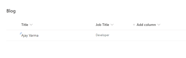
    SharePoint List: 

    The SharePoint List/Library will store the values as shown below.


    Conclusion

    This is how we can use the single value taxonomy picker control. Hope this helps you. 

     If you have any questions you can reach out our SharePoint Consulting team here.